When you create a historic chart, by default it will have a single Y axis. It will be shown on the left side of the chart, and it's range will be scaled automatically based on the range of values being charted.

Let's see what the default Y-axis looks like when two parameters are added to the chart. One will show battery voltage and the other will show temperature in degrees Celsius:

What's the problem with this?
In general, there are two reasons why the default Y-axis may not be adequate. The first would be if you are going to display multiple parameters that have different units of measurement (or are measuring totally different scales of the same unit of measurement). An example of this would be displaying voltage and temperature on the same chart; two different things are being measured, therefore two different axes are needed to display those measurements.
The second reason would be if you wanted greater control over the scaling of the Y-axis (or multiple Y-axes).
Our chart is an example of the first problem; the default Y-axis has automatically scaled to include the full range of both parameters, and this has resulted in a range of 0 to 15, in increments of 5. This scale is actually quite appropriate for the temperature parameter, but has completely masked the variation in voltage, which occurs at a much smaller scale.
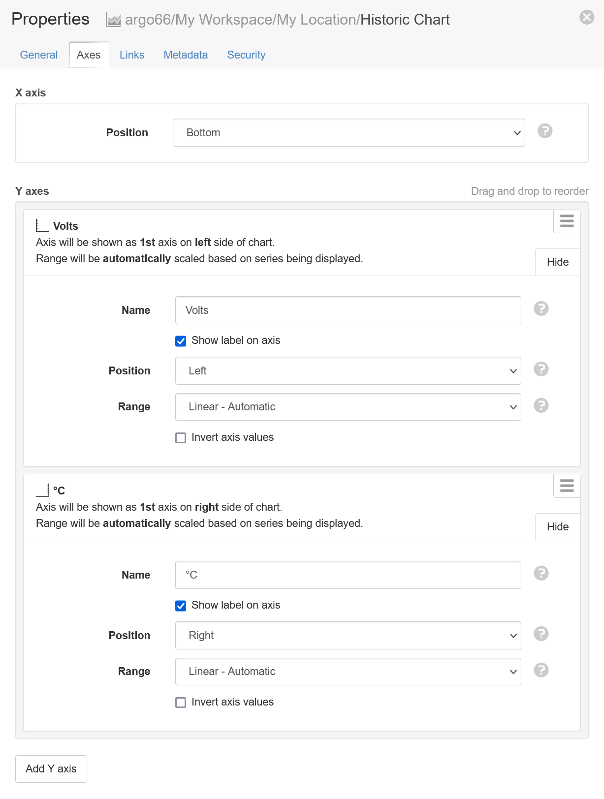
Lets now replace the default Y-axis with two custom Y-axes, one for each parameter. We start by clicking the Add Y axis button. We will create one Y-axis named Volts to represent the voltage, and another named °C to represent the temperature:

Note that the Volts axis will be positioned on the left, while the °C axis will be positioned on the right.
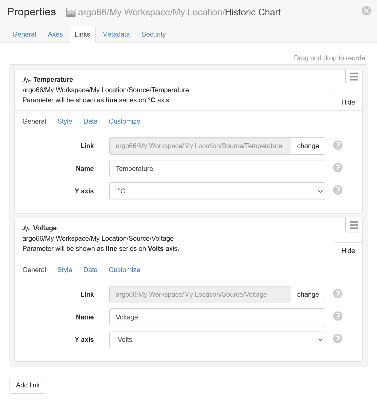
In addition to creating the 2 new axes, the chart links must be configured to use them:

Now that the Temperature parameter has been configured to use the °C axis and the Voltage parameter has been configured to use the Volts axis, lets look at the chart again:

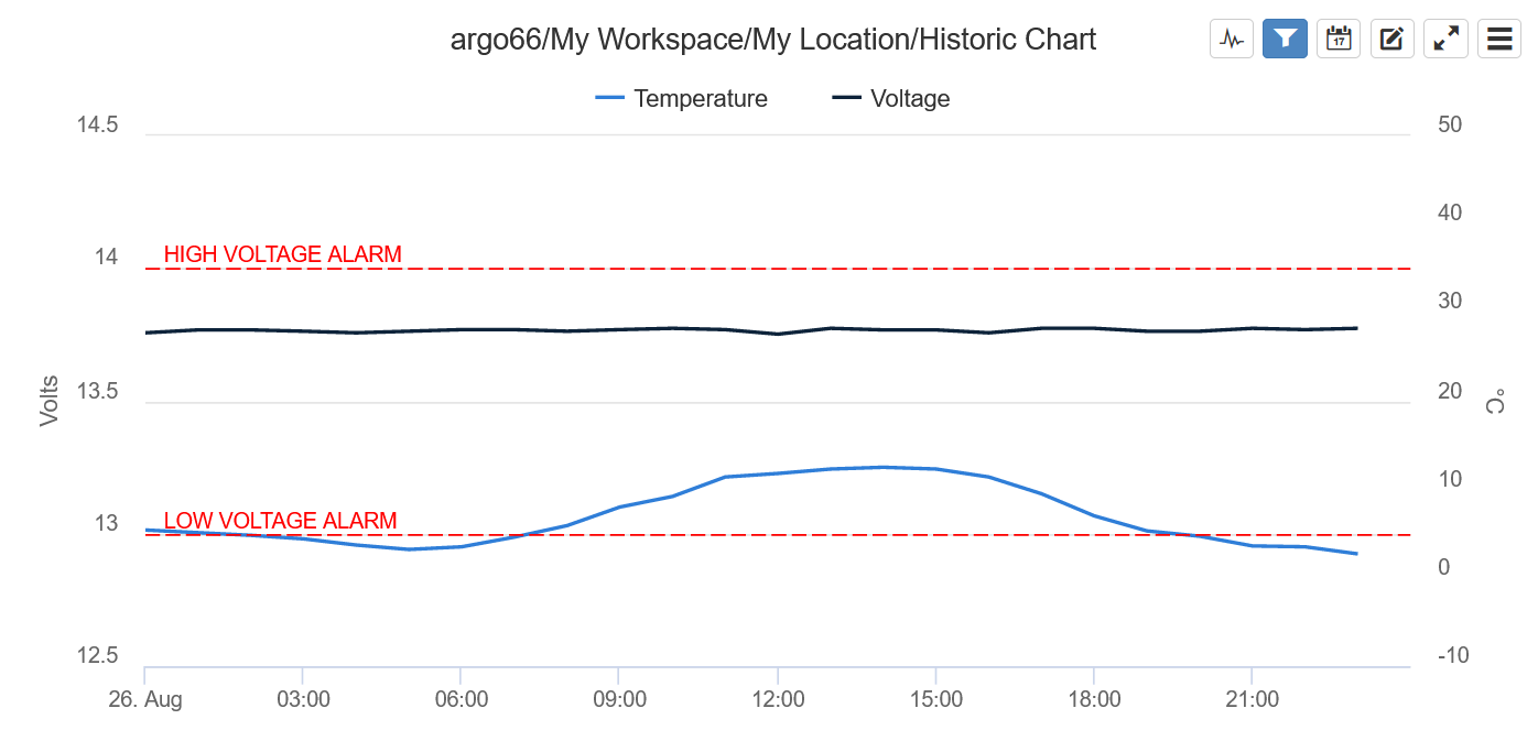
There hasn't been a dramatic change for the Temperature parameter, but the Voltage parameter is now able to demonstrate a much more detailed range of variation.
However, maybe the range is too tightly zoomed in now; what if we wanted to show the temperature in a way that is more representative of the possible values across an entire year, not just one day in winter? This brings us to the second reason for custom Y-axes: configuring a custom range.
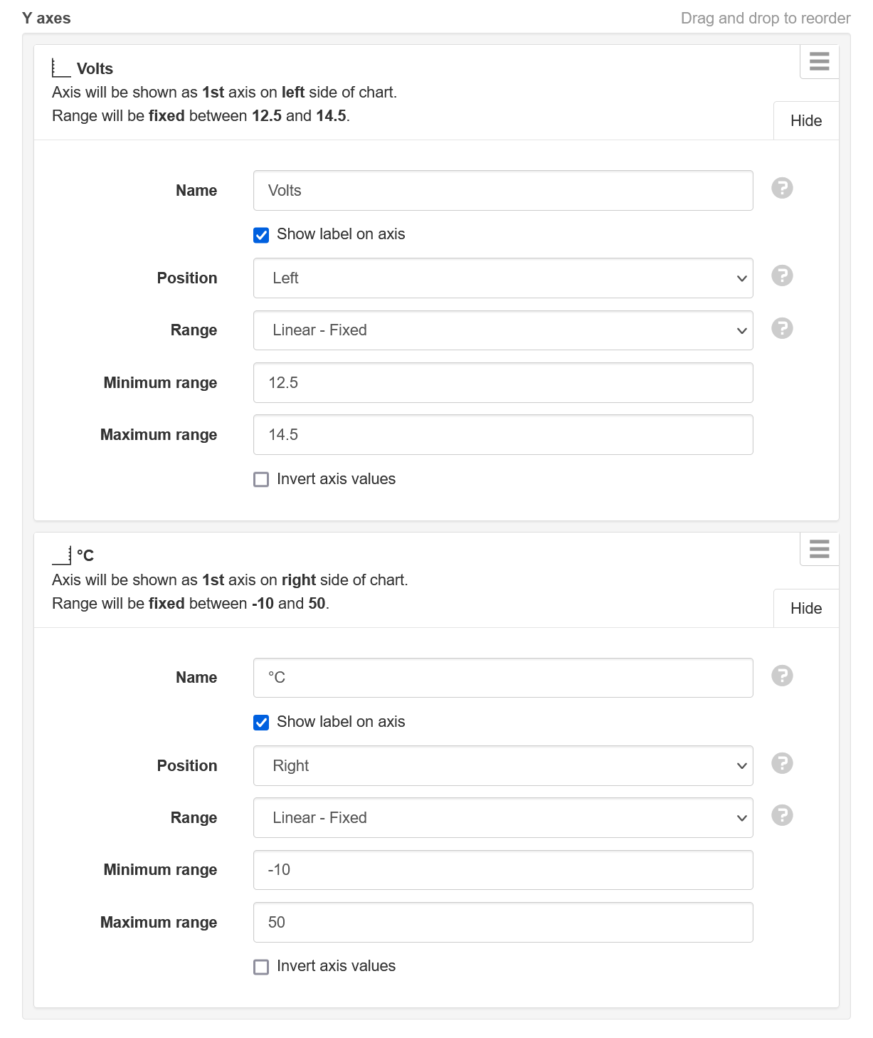
We can go back to the Axes configuration and this time configure a fixed linear range for both of our custom Y-axes. The Volts axis will be set between 12.5 and 14.5, as this will allow visibility of the low voltage alarm state at 12.0 and the high voltage alarm state at 14.0. The °C axis will be set between -10 and 50, to represent the full range of possible yearly temperatures at this location:

Looking at the chart again, something has gone wrong! We configured the Volts axis range between 12.5 and 14.5, but it is actually showing between 12 and 15. And we configured the °C axis range between -10 and 50, but it is actually showing between -25 and 50:

This demonstrates that setting a fixed range doesn't always result in that exact range being shown on the chart. It's more of a strong suggestion to the charting software about the range we want to see, but the software also considers other factors such as the amount of vertical space available. To demonstrate how vertical space can affect even a fixed range, lets resize the chart to be much taller:

The extra space has now allowed the charting software to display the exact range that we specified for both custom Y-axes.
