Sometimes a sensor or data logger will produce a value which is unwanted, clearly incorrect, or otherwise outside the bounds of normal data values. Some data loggers will deliberately produce a distinct number to indicate certain error codes. If this data is displayed on your charts, it can distort the y-axis and make all the other data less readable. For example, if your temperature readings normally fall within the range of 0ºC to 50ºC, and your logger produces an error code of 99999, then the resulting spike (if shown on a chart) will force the upper range of the y-axis up from 50 to 99999, which will cause all the normal values to be displayed as a flat line at the bottom of the chart.
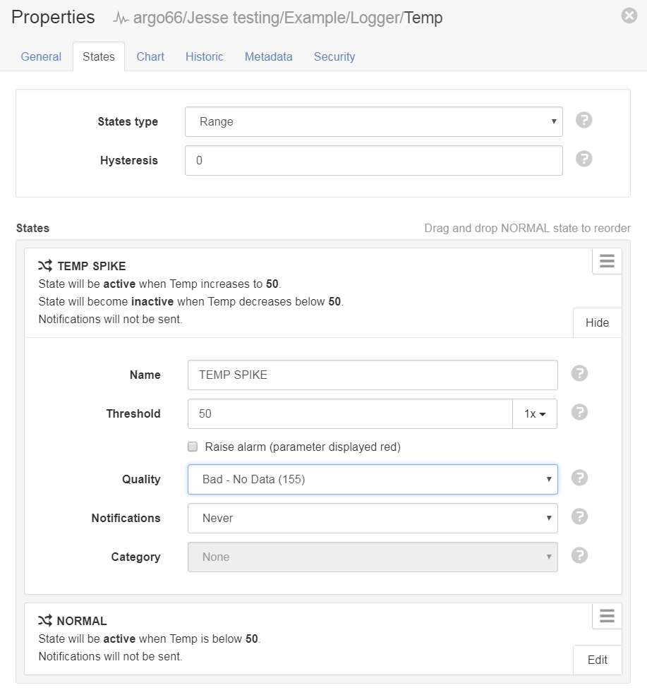
To avoid displaying unwanted data spikes, you can define them as a State in the Parameter configuration, and set a quality code on that State which will cause them to be excluded. In the example below, a temperature higher than 50ºC will fall within the "TEMP SPIKE" State, and will have a quality code set to "Bad - No Data". This quality code will cause it to be excluded from the chart view.

Note that alarms and notifications are not enabled in this example; the only effect of the State will be to mark the data as bad. You may also need to configure the effect of certain quality codes, which can be done in your account settings. In the example below, any quality code of type "Bad", which includes the specific "Bad - No Data" code, is set to be excluded:

One important consideration is that setting quality codes using the State method described above will only affect data that is ingested into the system after the State was configured. If you already have existing data spikes and wish to remove them, you would need to first configure the State, then export and re-import the data.
You can learn more about quality codes and how to configure them in the documentation.
